The decorative pole as a visual-identity element
In decorative projects, the pole isn't just a lighting fixture — it's an architectural element read in daylight before it's lit at night. The wrong design makes a space look visually busy or out of sync with the surrounding architecture.
Golden rule: a decorative design serves the place, it doesn't fight it. The stronger the architectural context (a historic building, an upscale hotel, a carefully designed garden), the quieter and less competitive the decorative design should be.
Classical / Italian style
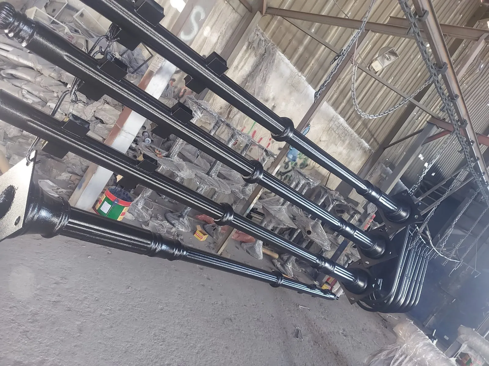
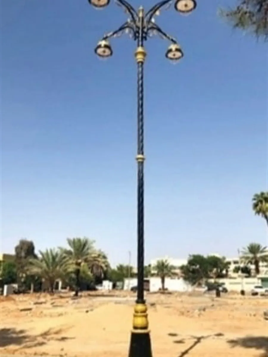
Inspired by Mediterranean cities: a sculpted base, a slender shaft, a lantern head. Suited to tourism walkways, heritage hotels, and palace gardens.
It works best when repeated at a regular rhythm (every 8-10 meters) along a walkway. With a warm lighting system (2700K), it creates an intimate atmosphere in the evenings.
Modern / geometric style
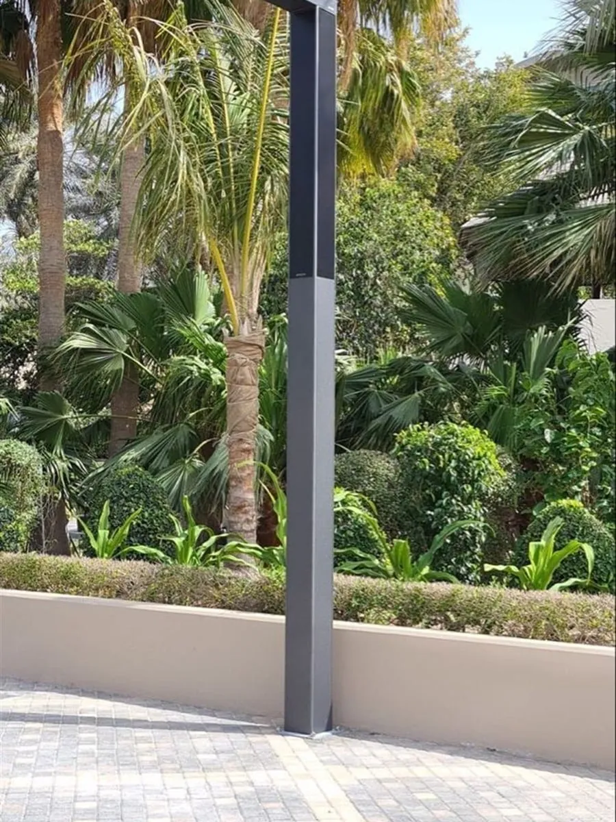
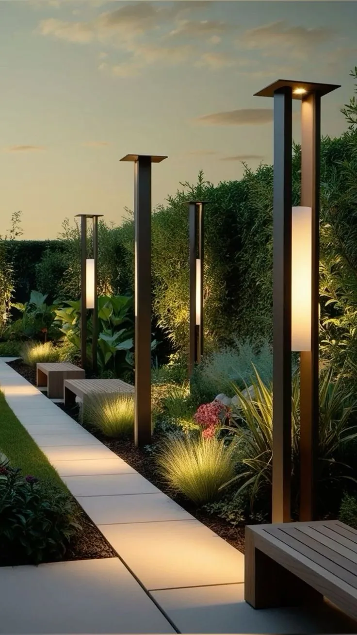
Clean lines, cylindrical or pyramidal, with a hidden base or one merged with the ground. Suited to contemporary projects, corporate gardens, university campuses, and walkways inside modern residential compounds.
Matte black or dark gray is preferred, with a 3000-4000K LED head for neutral, functional light.
Laser cutting — deeper customization
Laser-cutting allows precise etching on the pole structure — the project's logo, a decorative motif inspired by local architecture, or perforations that cast a luminous shadow on the ground when lit internally.
A distinctive solution for hotels with a unique character, new tourism destinations, and projects investing in the visitor experience after dusk.
When to mix styles
General rule: don't mix more than two styles in a single site. You can have classical decorative poles on the walkways and modern functional poles in the parking lots, but within each zone keep the style consistent.
If you want a tailored recommendation, our team provides preliminary visual boards with the quote — useful for visualizing the result before manufacturing.
Frequently asked questions
What is the difference between a classical Italian pole and a modern geometric pole?
The classical Italian style draws on Mediterranean cities: a sculpted base, a slender shaft, and a lantern head, and it suits tourism walkways, heritage hotels, and palace gardens. The modern geometric style uses clean cylindrical or pyramidal lines with a hidden base or one merged with the ground, and it suits contemporary projects, corporate gardens, and university campuses. The practical rule is that the design should serve the architectural context rather than fight it — the stronger the surroundings, the quieter the decorative design should be.
What colour temperature (CCT) is appropriate for decorative poles?
Colour temperature is a question of visual atmosphere rather than just a number; warm white around 2700K creates an intimate feel on classical walkways and heritage hotels, while contemporary settings tend toward 3000–4000K for neutral, functional light in corporate gardens and campuses. The general rule is to pick the lowest colour temperature that still meets the visual and safety need while controlling glare. The final value is set with the site's lighting design, and the road photometric-spec side is covered in the SASO and IEC specifications guide.
What does laser cutting add to a decorative pole design?
Laser cutting allows precise etching on the pole structure — the project's logo, a decorative motif inspired by local architecture, or perforations that cast a luminous shadow on the ground when lit internally. It is a fitting solution for hotels with a unique character, new tourism destinations, and projects investing in the visitor experience after dusk. Perforation areas are accounted for in the structural calculations and under wind loads to preserve the pole's rigidity.
Can more than one decorative style be mixed within a single site?
The general rule is not to mix more than two styles in a single site, to preserve visual consistency. You might, for example, use classical poles on the walkways and modern functional poles in the parking lots, but the style stays consistent within each zone. Keeping the finish, colour, and spacing uniform helps the place read as one coherent identity.